Espression Arts Cafe
Located on Canterbury’s historic King’s Mile, Espression Art Cafe has long been a gathering place for artists, residents, and visitors. With a strong connection to the local creative community, the café provides a welcoming space where art, conversation, and everyday life intersect.
The design work for Espression focused on capturing that spirit—celebrating its artistic roots while creating a visual identity that reflects the warmth, creativity, and community at the heart of the cafe.
Espression came to me to update their visual identity as they expanded into a Community Interest Company (CIC) and began collaborating with other non-profits. The existing logo, which had been in use since the café’s early days, no longer felt confident or appropriate for this next stage.
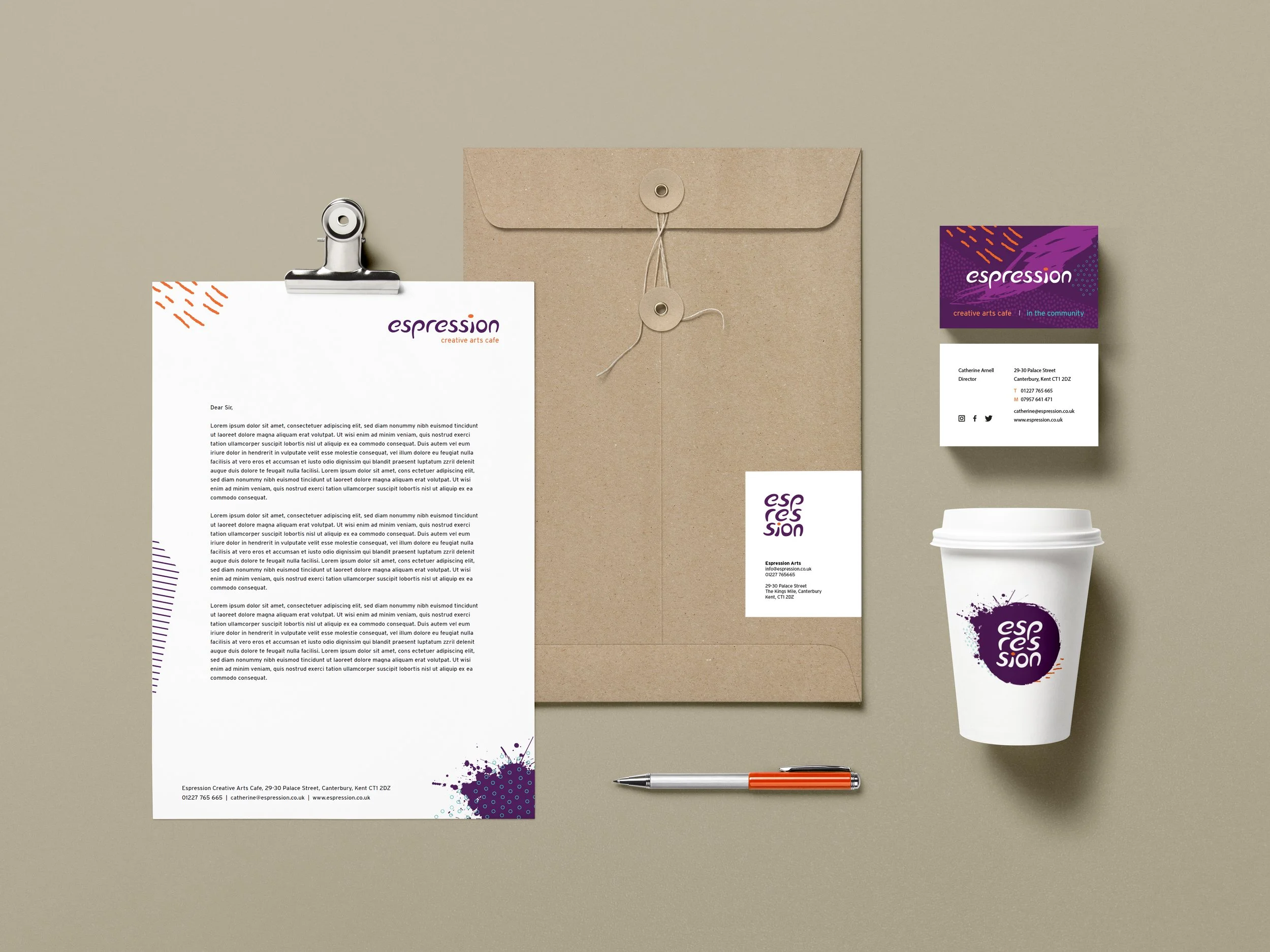
Stationary
The original logo included elements the owners wanted to retain and was also part of a much-loved and impactful design on the café’s façade. It was important that the updated brand spoke the same visual language, while being confident enough to sit alongside larger, more established CICs.
Logo redesign
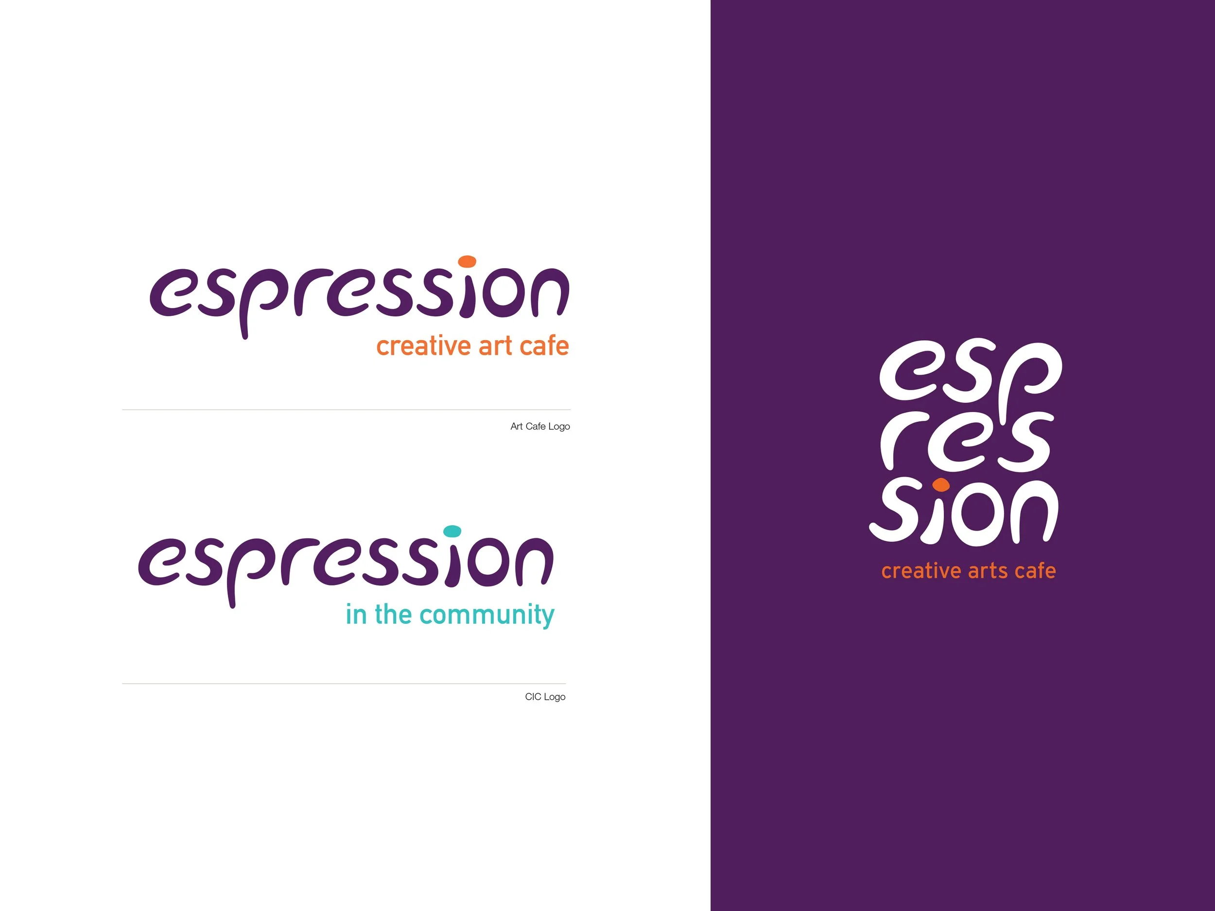
I developed a hand-drawn, playful logo that was simplified and refined, while still leaving room for creative expression. I created a suite of logo variations, including distinct marks for the art café and its community-focused CIC work, as well as a stacked version designed for avatars and other space-restricted applications.
Full logo suite
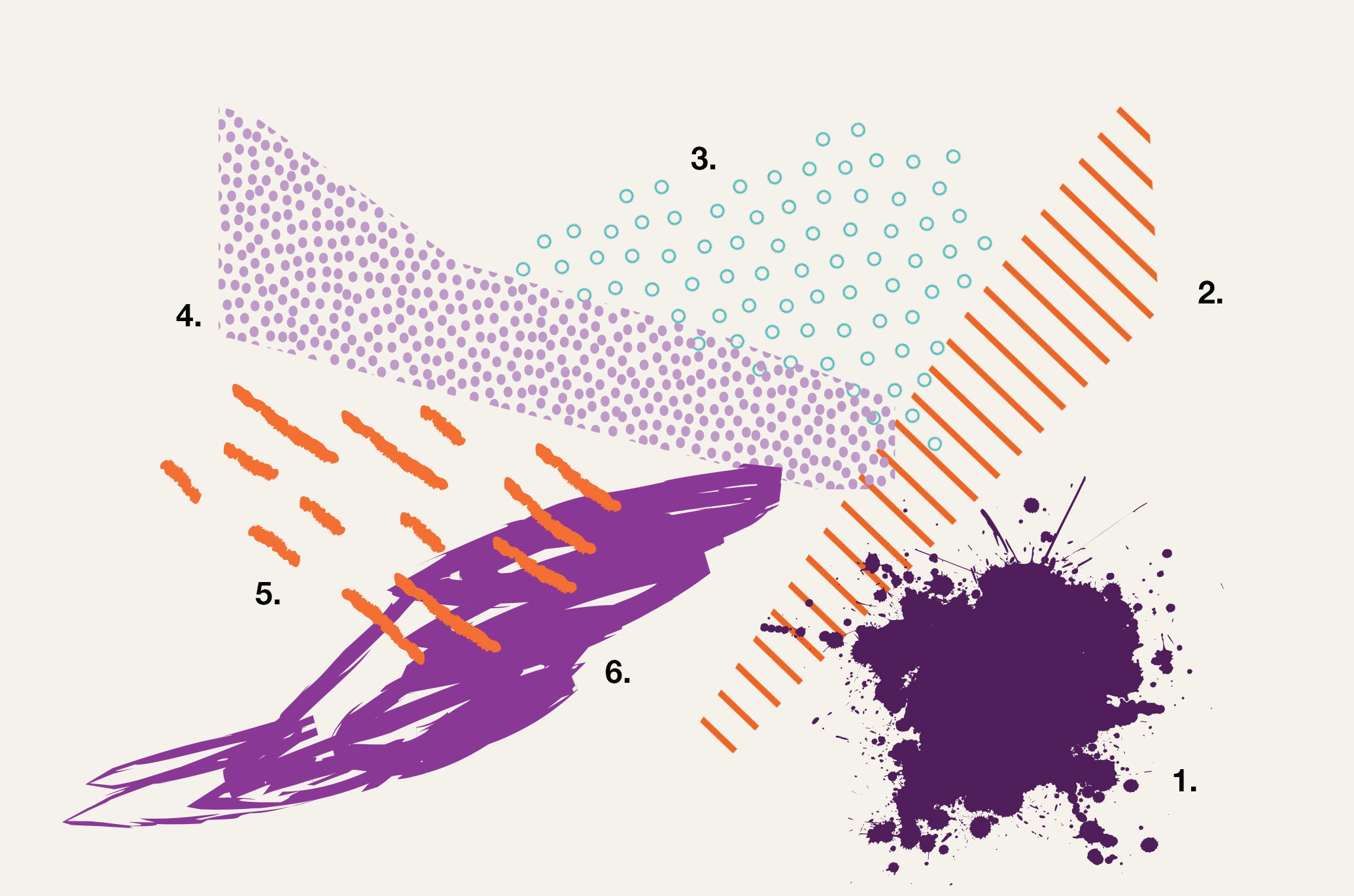
To round out the brand language, I developed a set of flexible graphic elements designed to layer with imagery and the wider colour palette, either individually or in combination. This was a simple yet effective tool to hand some of the brand control back to the organisation.
Brand design elements
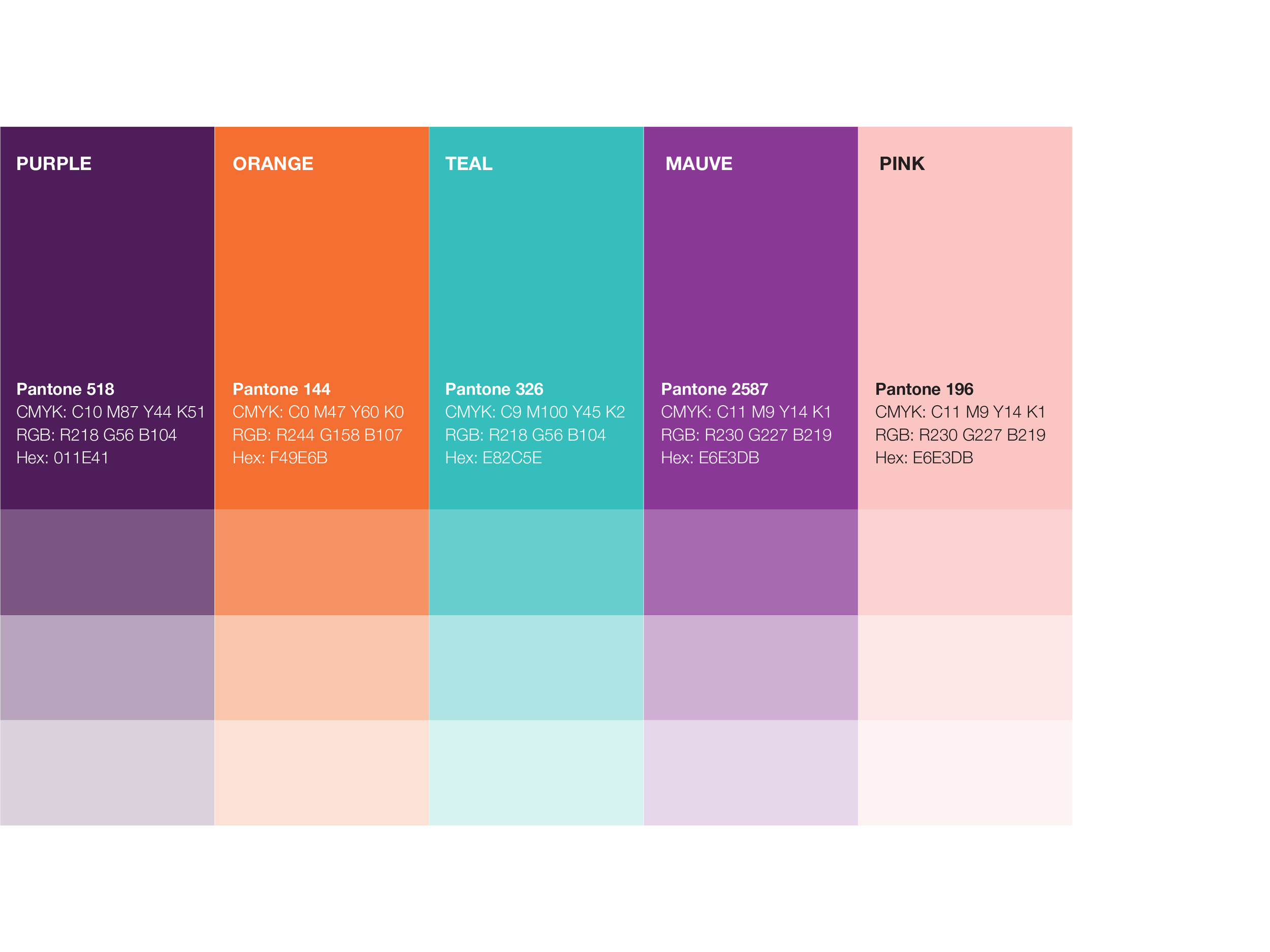
The colour palette remained rooted in the brand’s history, with deep purple retained as the primary colour. The supporting palette was inspired by the original brand and carefully updated and refined to feel more contemporary.
Brand colours
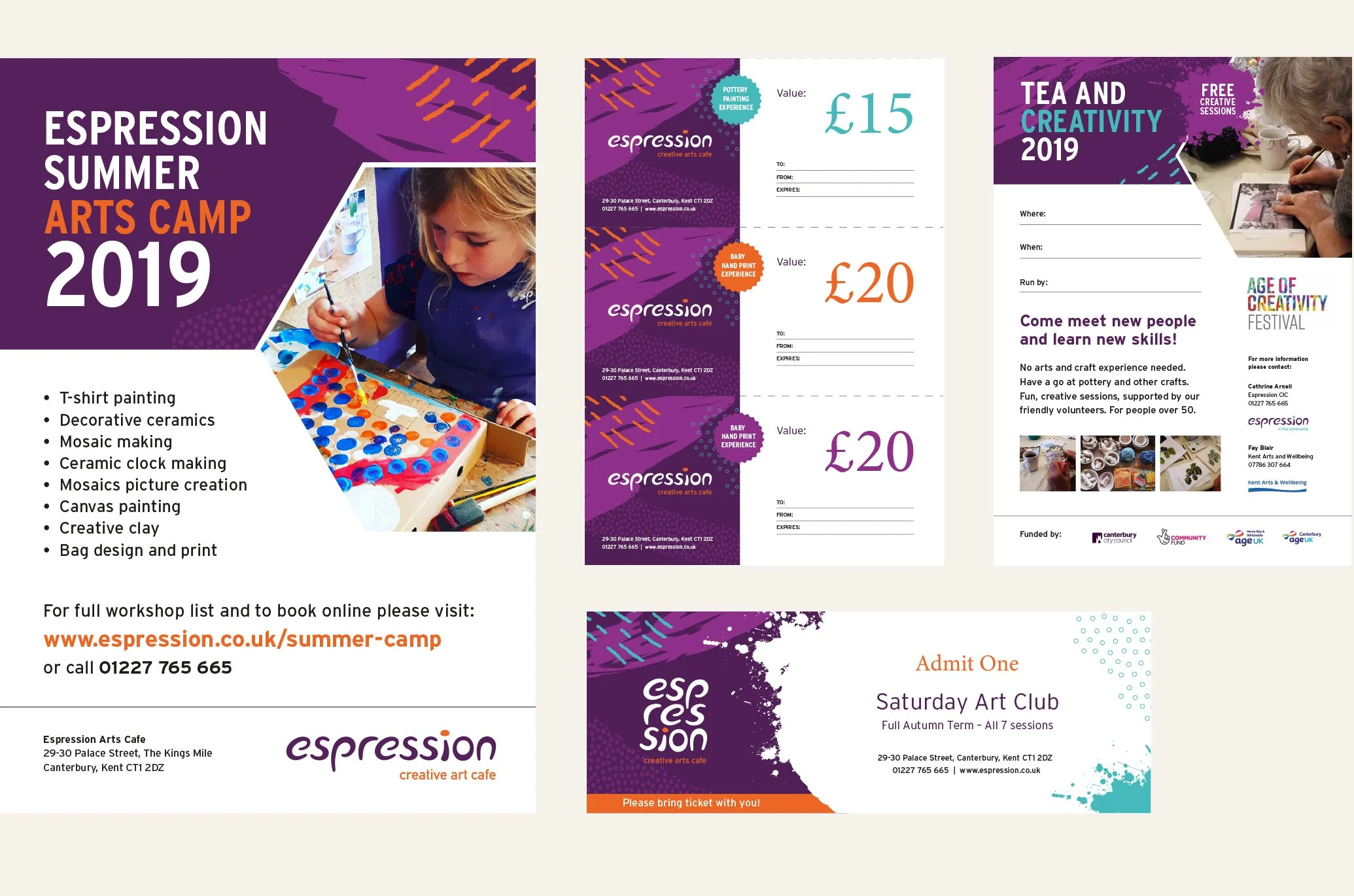
I applied the brand elements across a range of printed marketing materials, including posters, flyers, tickets, and gift vouchers, resulting in a flexible, creative, and enjoyable brand system to work with.
Marketing collateral

I also created a decorative brand pattern for use on tissue paper to wrap and protect ceramics and other handmade pieces. The pattern was designed to be adaptable, with future applications such as tablecloths or backdrops offering a playful way for the café to continue expressing the brand.