Lighthouse Craft Pub Brand Identity
Located in Canterbury, the Lighthouse was originally a lighting shop before being explored as a concept for a craft beer venue. Retaining the historic name provided a natural starting point for the brand identity.
The design concepts reinterpret the lighthouse motif through the lens of craft beer culture, creating a visual language that connects the venue’s history with a contemporary craft aesthetic.
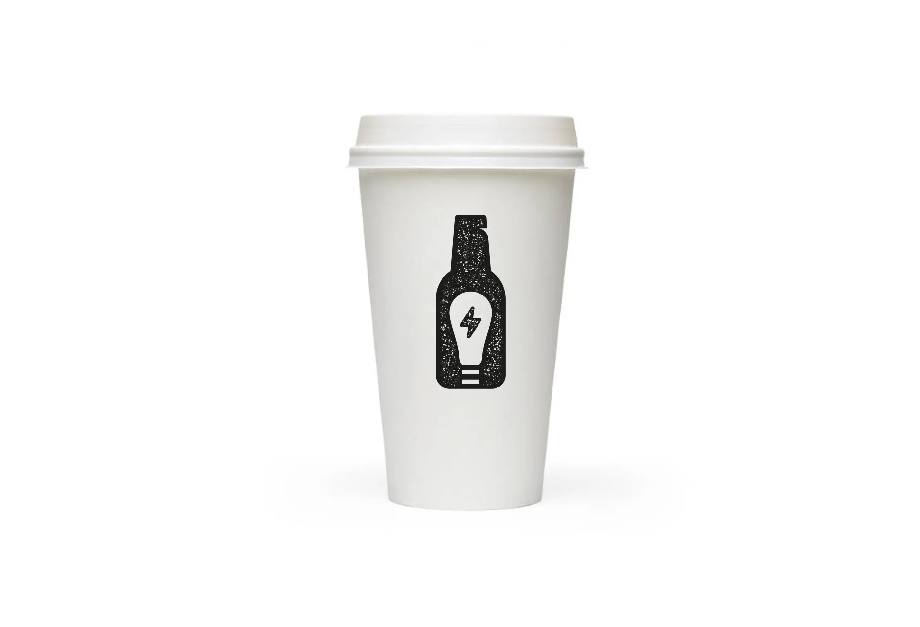
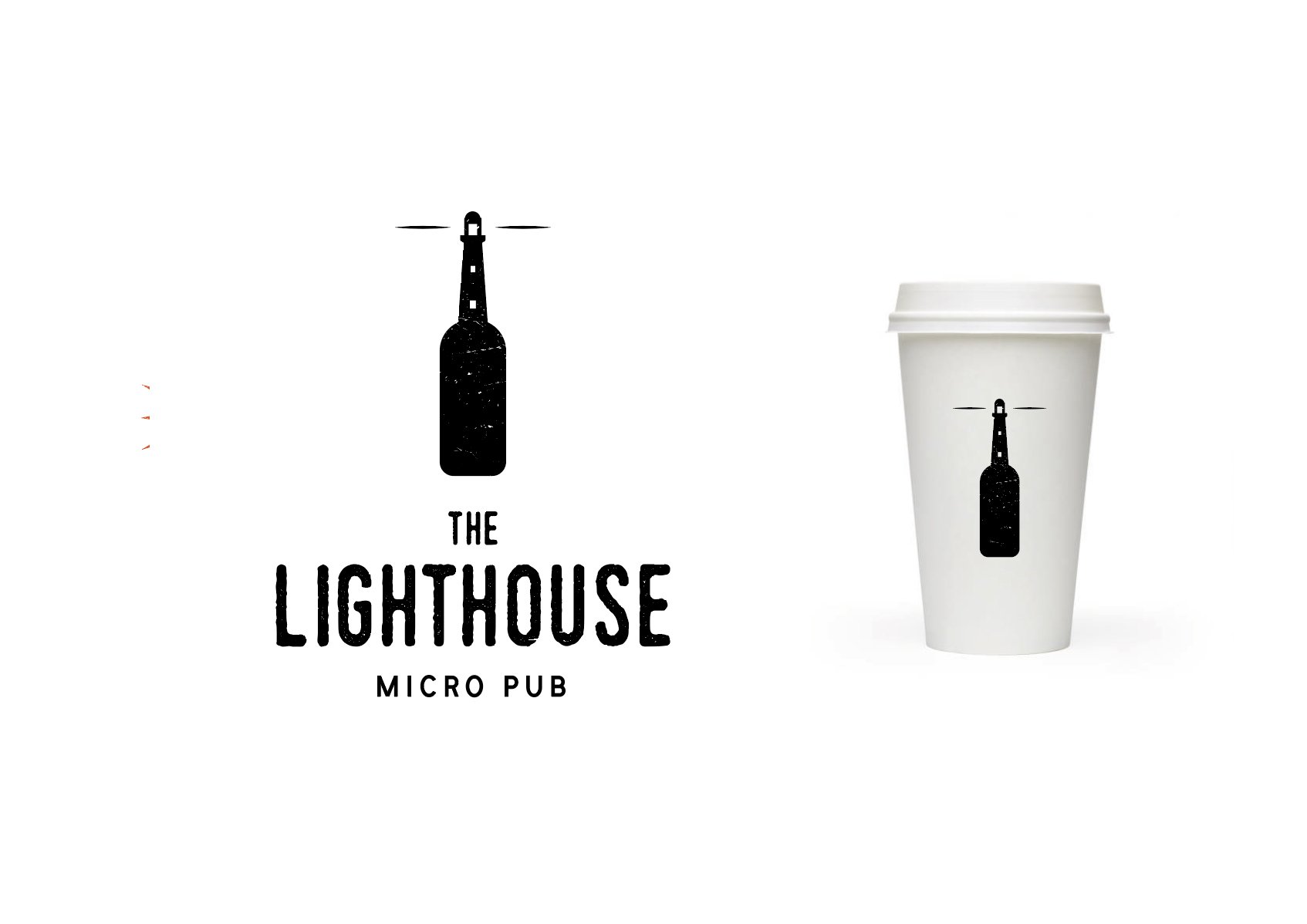
After exploring a range of ways to combine themes of light, lighthouses, and electricity with craft beer, this selected logo emerged as the final direction. I gave the mark a handcrafted feel while ensuring it remained bold and eye-catching. Ultimately, a change in use created challenges during the planning process, and the project did not move forward.
Final logo
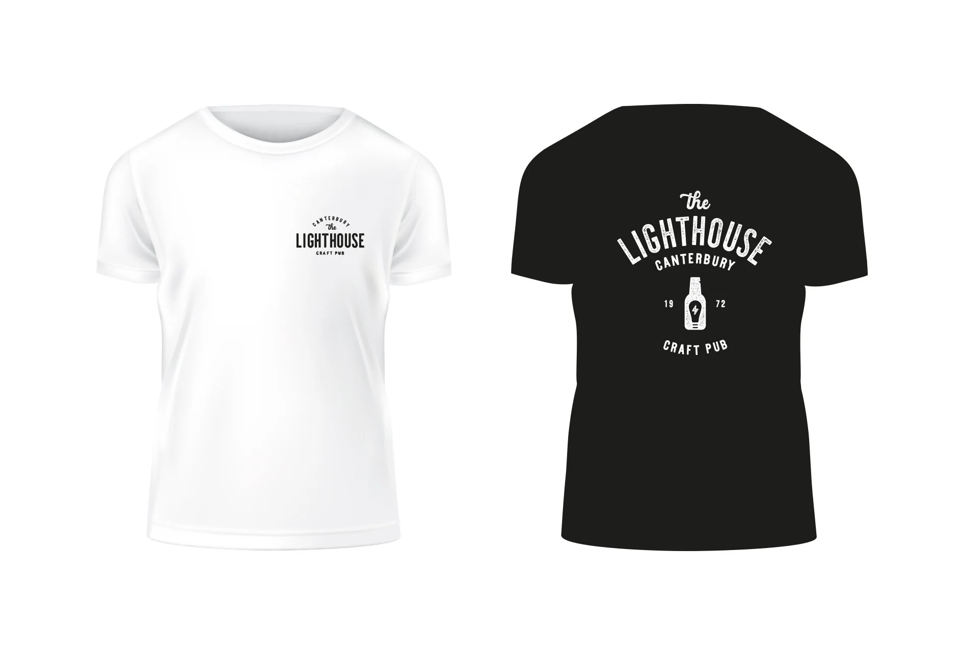
I designed simple staff T-shirts that worked across both sides of the venue’s identity, supporting its transition from a cosy daytime coffee shop to a craft pub in the evenings.
Staff T-shirts
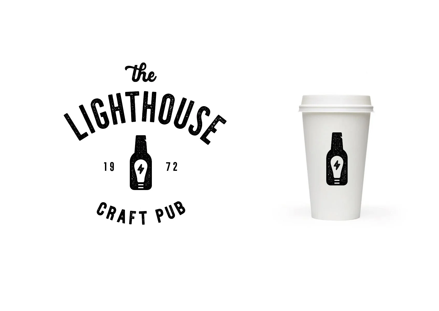
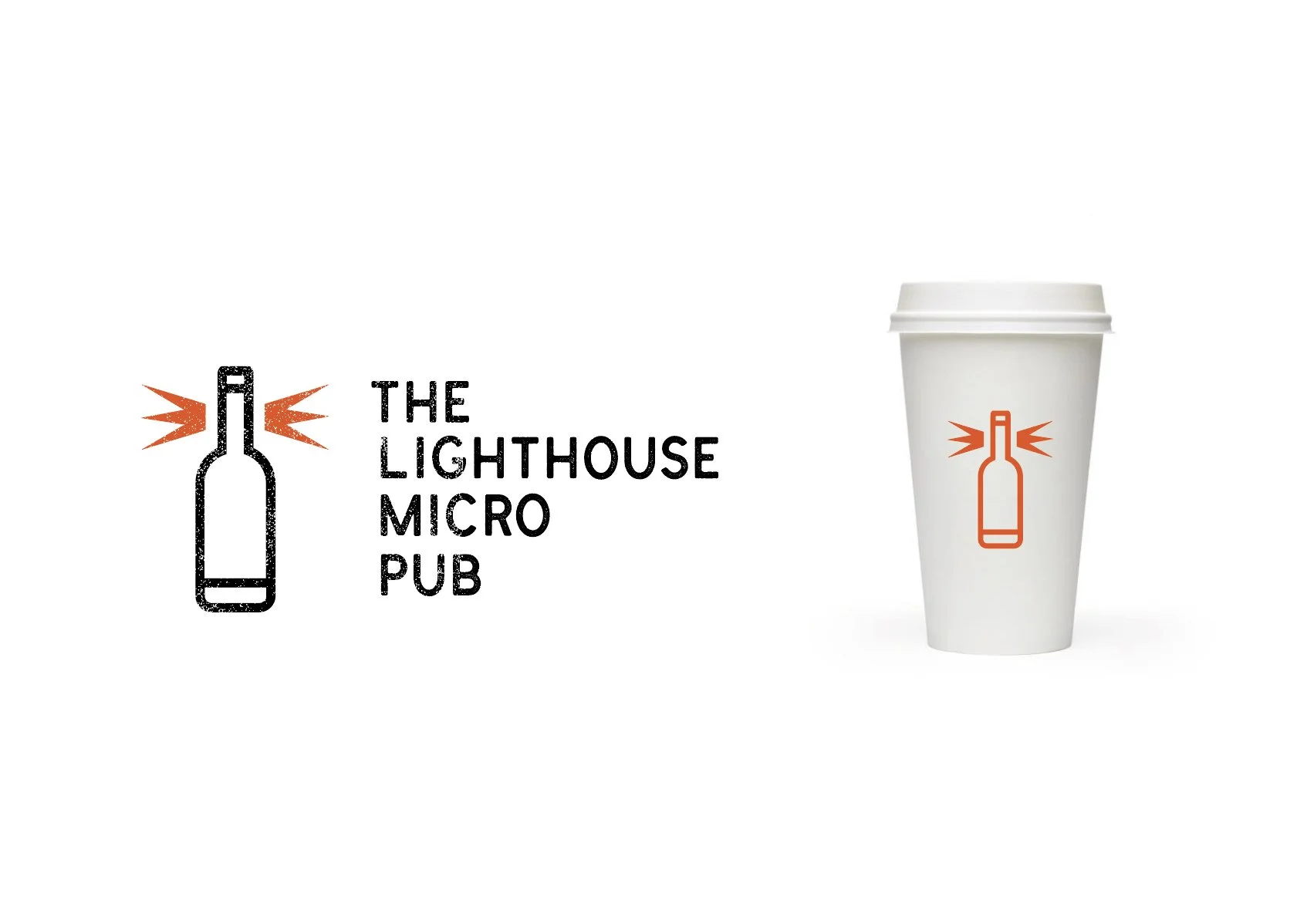
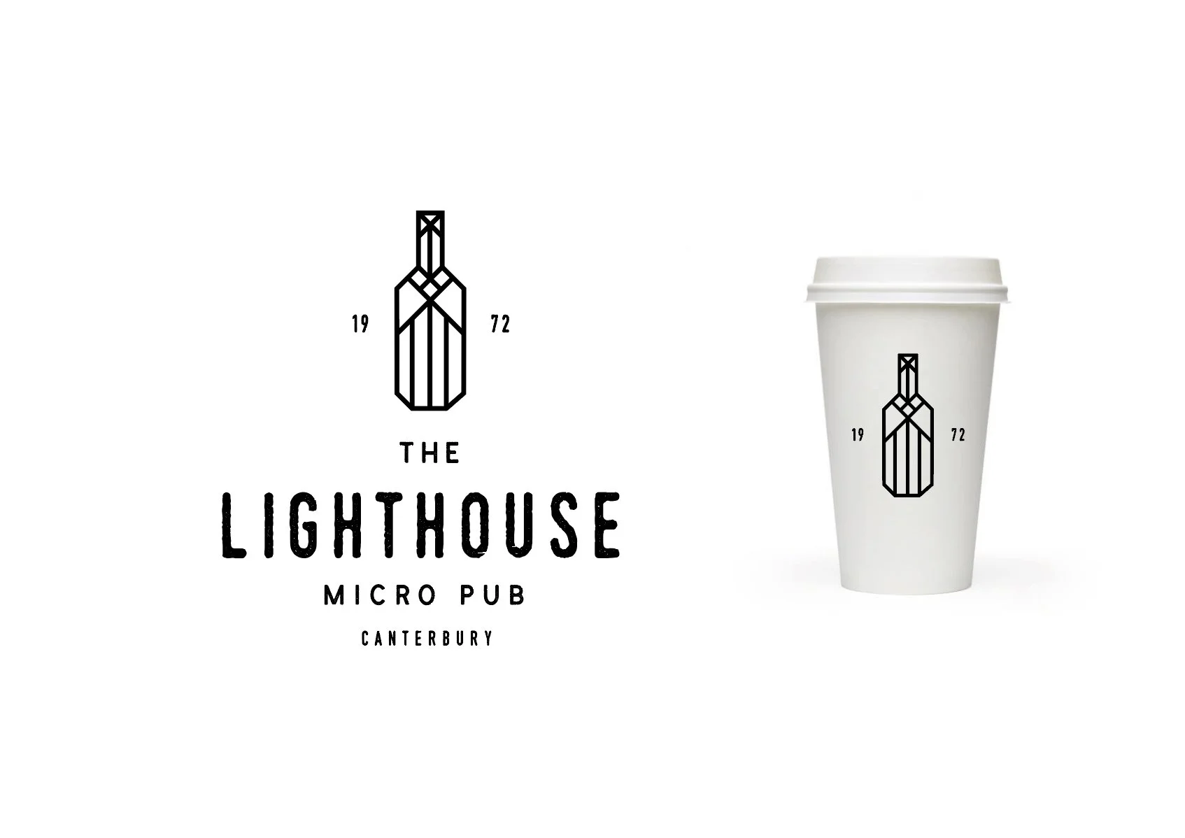
I explored several alternative logo directions, ranging from more modern interpretations to more traditional designs, before arriving at the final selected mark.
Design alternatives
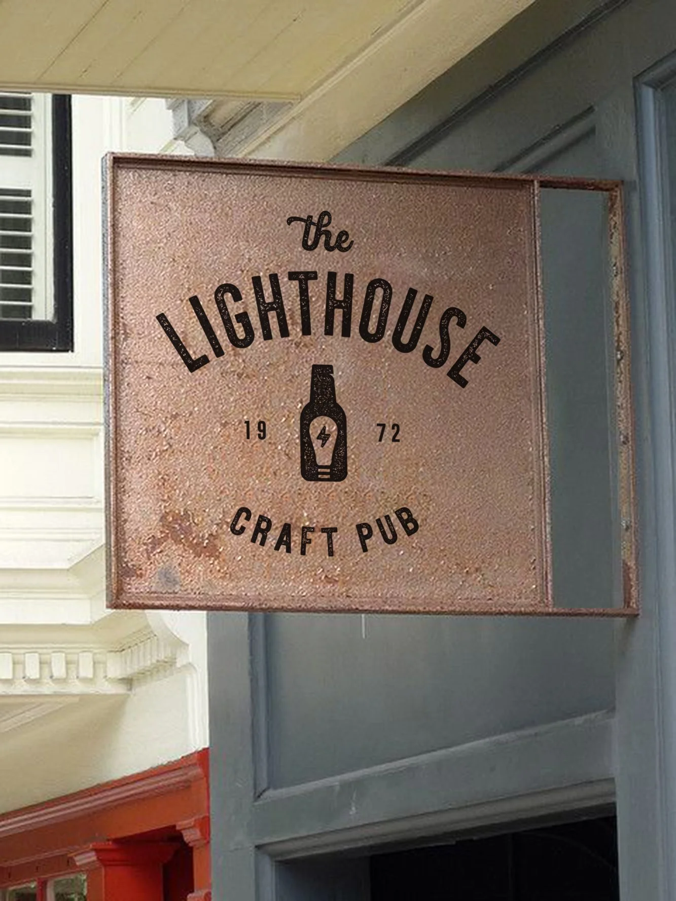
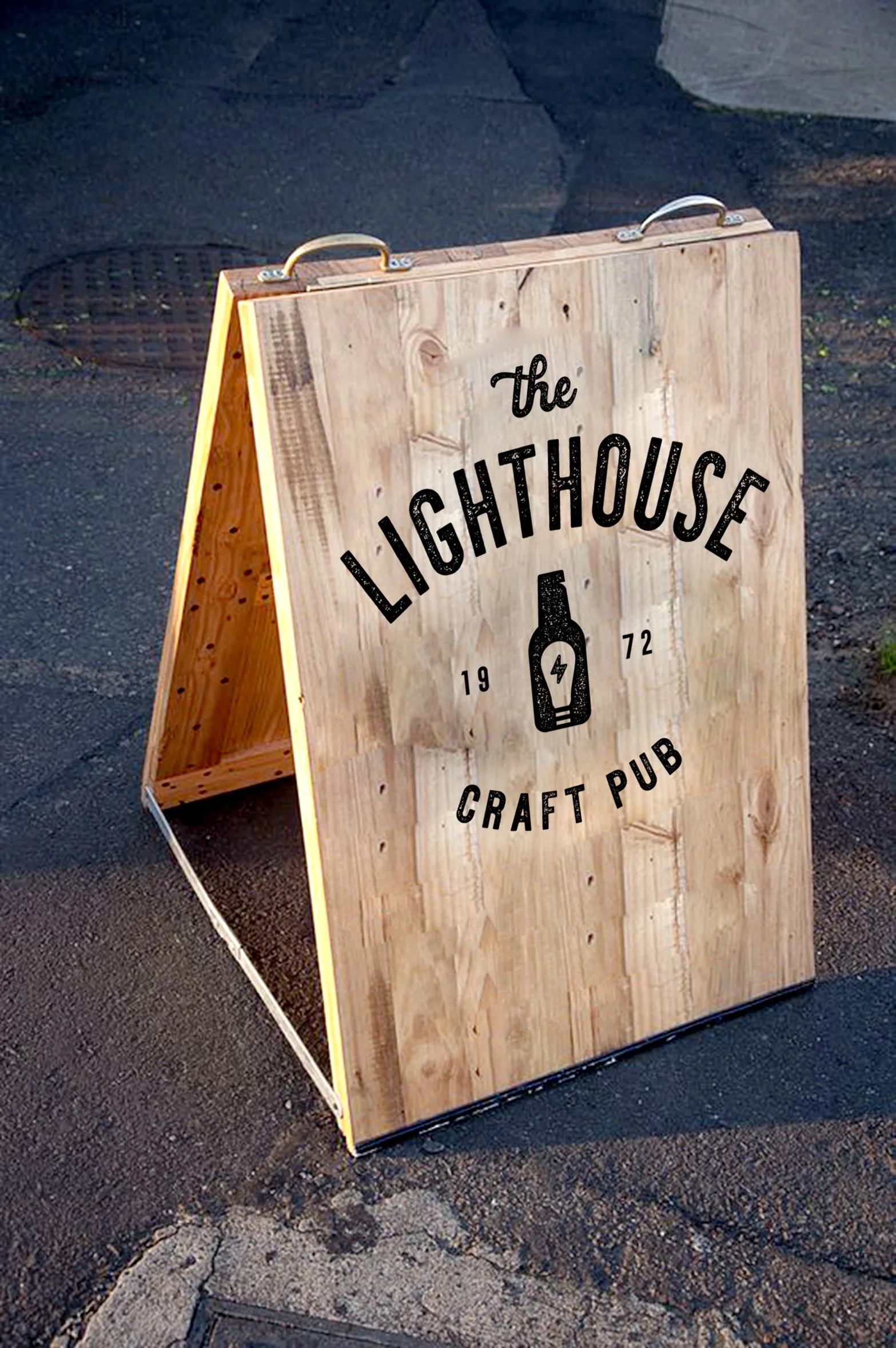
I explored signage options for the Grade II listed building, leaning into a handmade, artisan quality that reflected the craft and variety of the beers on offer.
Signage options
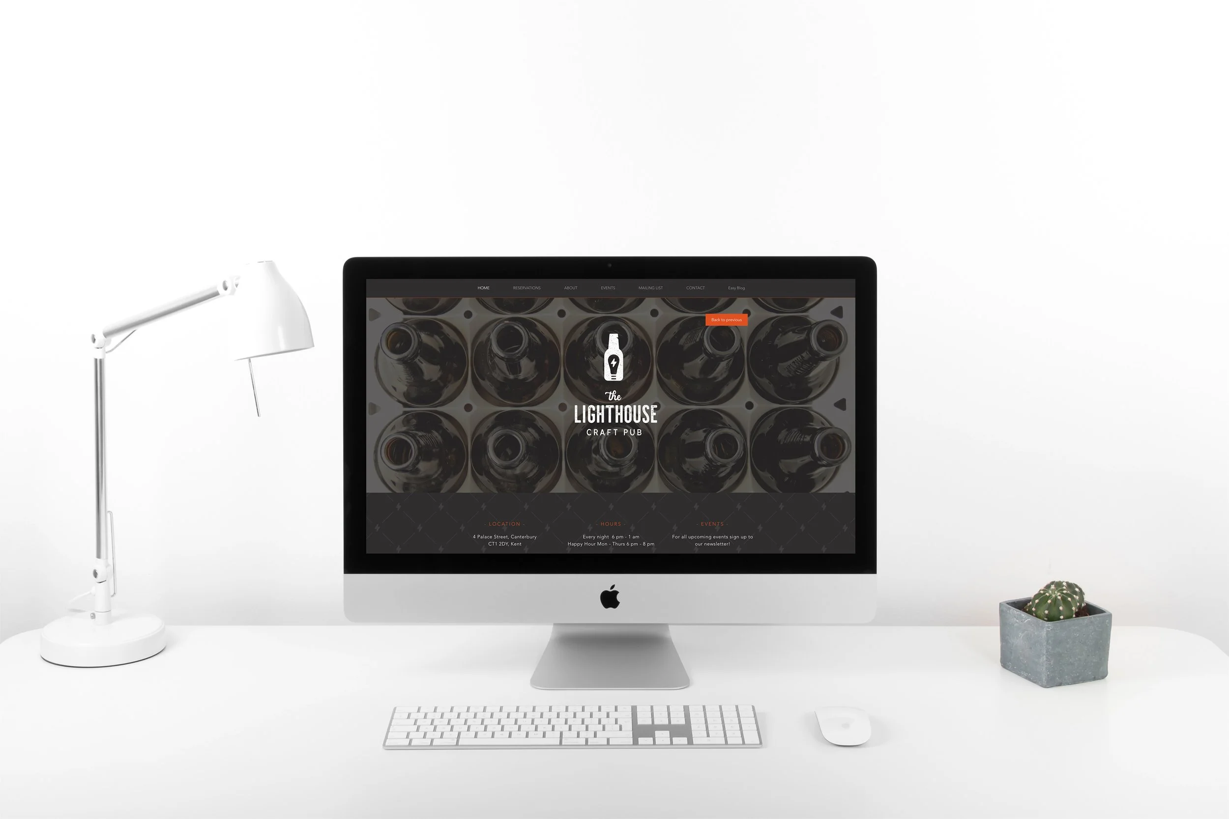
I designed a simple holding page for the upcoming website, providing a clear and confident presence while the full site was in development.